top of page
Microsoft | Brand Website UI/UX
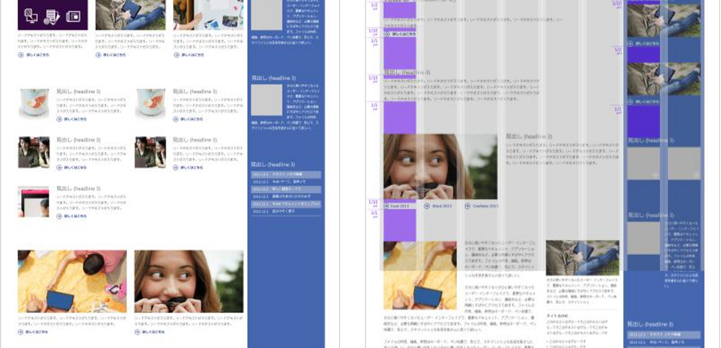
Much of the proposal has been incorporated as it was provided, notably how the site employs a clear colour theory application as well as the essence of the underlying grid/rules applications.
UI / UX guideline as part of the new brand launch
In 2012, Microsoft executed a global rebranding, changing the logo and core identity of the company. By late 2012, they had not yet created a Global Website User Experience and each region’s website were not mobile-adapted nor consistent in their design application.
Leveraging my relationship with the Microsoft Global Creative Director, we put together the initial UX thinking behind the new responsive, global website templates in use today.
Microsoft Brand Site UI/UX
6 Columns + 2 for flexible layouts
The original proposal included maintaining a sidebar which was at the time integral to the existing website. The UI/UX was implemented globally..
Colour Language
We created colour rules and applications to differentiate services and products,
and unify how consumers experience content on the website.
Device + Content Rules
We crafted a responsive HTML5 UX/UI development guideline, corresponding mechanical and typographical rule definitions that work across browsers
and devices.

UI / UX guideline as part of the new brand launch
In 2012, Microsoft executed a global rebranding, changing the logo and core identity of the company. By late 2012, they had not yet created a Global Website User Experience and each region’s website were not mobile-adapted nor consistent in their design application.
Leveraging my relationship with the Microsoft Global Creative Director, we put together the initial UX thinking behind the new responsive, global website templates in use today.
UI/UX Brand Website Guideline for New Brand Launch
Microsoft | Brand Website UI/UX

bottom of page


